Design-system workflow
How a shared component goes from a prototype into merchant-ui: find one, propose one, review what each release shipped, and adopt it. Day-to-day drafting lives in Sketch for designers; CLI and MCP setup in Sketches for engineers.
One library, three surfaces
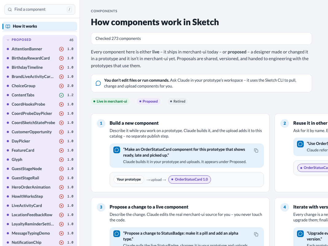
Sketch keeps one Thanx-wide component library. Every component in it is live – it ships in merchant-ui – or proposed – a designer made or changed it in a prototype and it isn’t in merchant-ui yet.
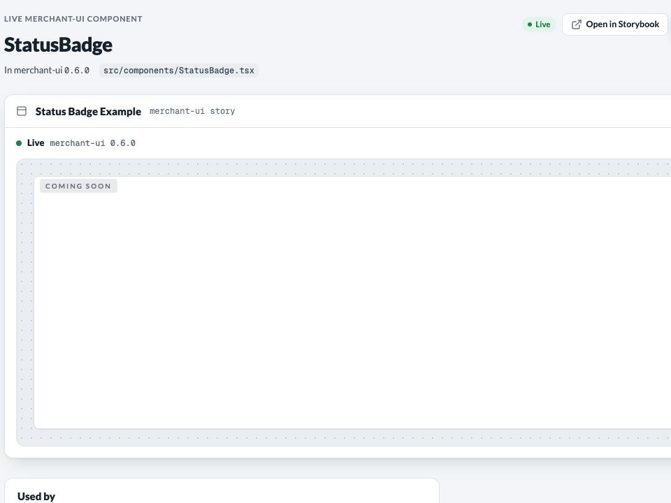
- The catalog – Components in the top bar. Proposed, Live and Adopted groups, one page per component, and the release review.
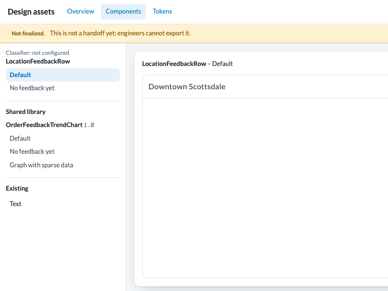
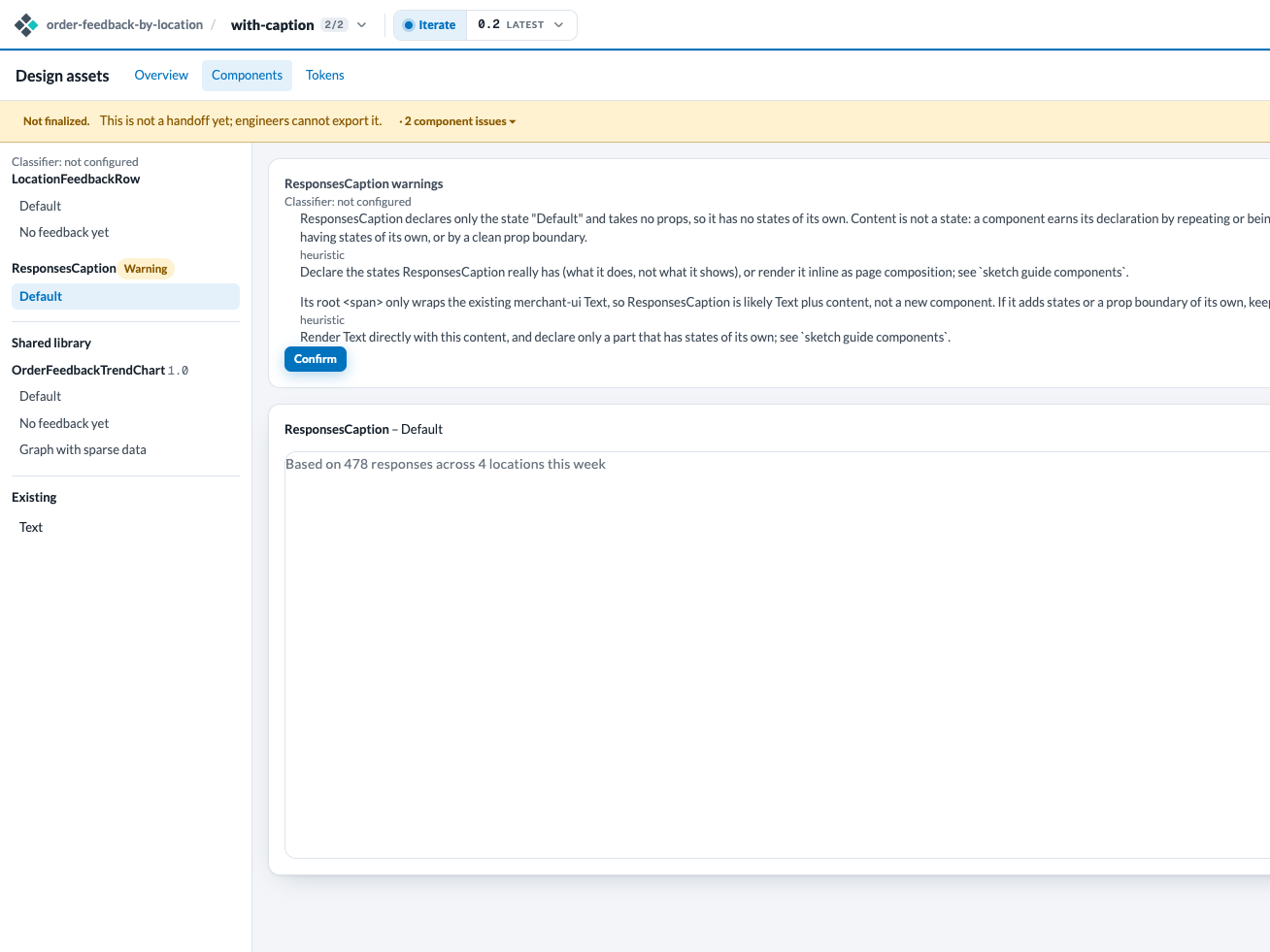
- The viewer – Design assets then Components on a prototype version: the components that version uses, with their states and warnings. Switch any preview from Story to Playground to set its props, watch each handler call and try stress cases; catalog component pages have the same switch.
- Claude – ask in your prototype’s workspace. Claude runs sketch component commands for you; the MCP tools component_library_list and component_library_show read the same library.
 ✥
 ✥
 ✥
How it works, the first entry in the catalog’s side navigation, walks through building, reusing, changing, versioning, shipping and reviewing a component. This guide adds what happens around those steps rather than repeating them.
Find before you build
Before writing a component, Claude looks for one in this order: a live merchant-ui component, then a shared library component someone already proposed, and only then a new one. Something earns a component only if it repeats or is built as a unit, has states of its own, or has a clean prop boundary; a page chunk is a screen. The full rules are sketch guide components.
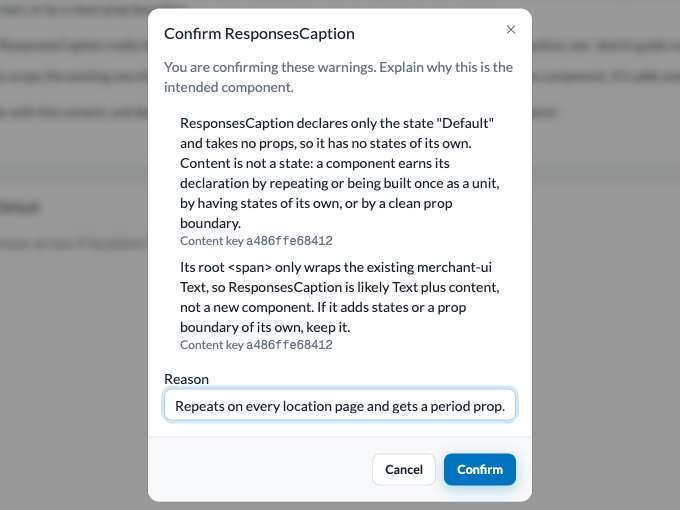
Publishing a React version checks every proposed component against those rules. Anything that looks like content, a wrapper around an existing component, a page chunk or simply too large gets a component warning – a flag that it may not deserve to be a component – in Design assets, Components. Unconfirmed warnings block Finalize until the component is reworked or confirmed.
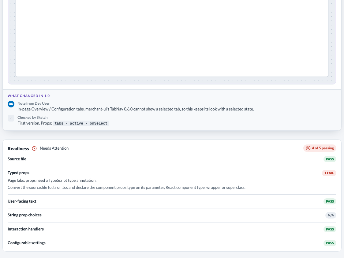
Finalize also scores each proposed component for readiness: what an engineer would otherwise fix before adopting it.
- Always block: no source file of its own, plain JavaScript or untyped props, and a design system older than the latest.
- Block unless you confirm: fixed user-facing text, a string prop compared against fixed words, an interaction with no handler passed in, and a hard-coded setting.
The catalog shows each library version’s result as a green, yellow or red icon, and its page lists every rule. When the classifier was off or the rules changed, Check N components on the catalog landing page and Re-run check on a component page score what is missing; a run that hits the daily limit keeps what it scored and finishes the next day.
 ✥
 ✥
 ✥
 ✥
 ✥
Confirming says “I intend this component as it is.” Claude asks you first, passes your own words as --reason, and never confirms on its own, never just to make Finalize pass. A confirmation holds until the component’s source or states change.
Propose a new component or a change
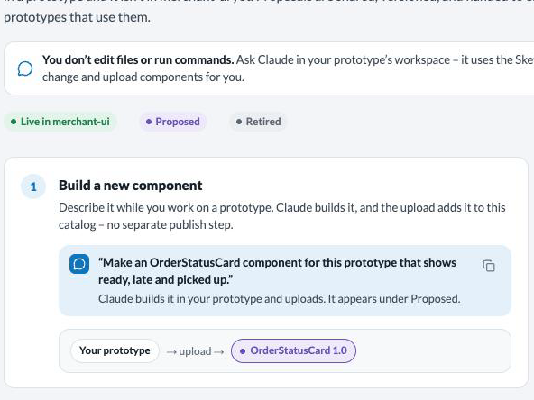
Describe it to Claude while you work on a prototype. There are two kinds:
- A new component – Claude builds it in your prototype, and publishing the version adds it to the library as 1.0. One name is one entry, Thanx-wide; a name that matches a live merchant-ui component is refused unless it is declared a change.
- A change to a live component – Claude pulls the real merchant-ui source into your prototype, edits it and uploads. The change records which merchant-ui version it was based on, and replaces the live component only in your prototype’s own code.
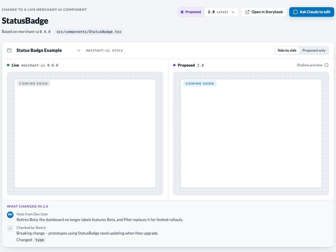
Propose a change to StatusBadge: make it a pill.
A private draft previews the component; publishing a version is what publishes it to the library. Each version carries a short note in your words, and Sketch checks its props against the version before it. Claude builds each new component ready for Finalize from the first draft: its own .tsx file, typed props, text and settings passed in as props with today’s values as defaults, and a callback prop for every interaction. Every upload tells Claude what it missed, and it fixes that without asking you.
 ✥
 ✥
 What changed – the author’s note and Sketch’s check
show a changed prop and a breaking change.
Versions, “Used by” and upgrades
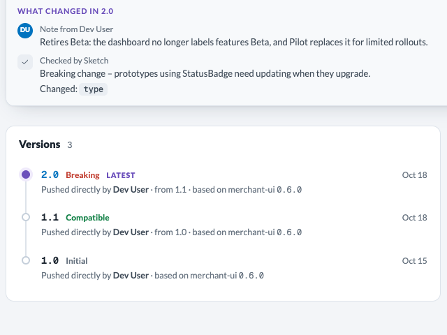
Every published change is a new, unchangeable version. Sketch reads the props: styling or a new optional prop is compatible (1.2 to 1.3); a removed, narrowed or newly required prop is breaking (1.3 to 2.0). Each prototype version keeps the exact library version it was built with, so nothing moves on its own.
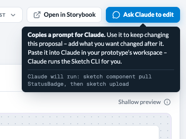
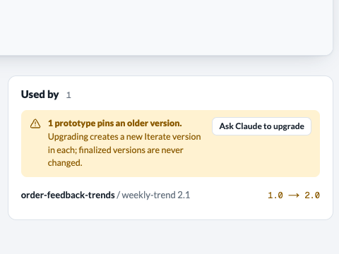
Used by lists the latest version of every variant that uses the component. When some use an older version, Ask Claude to upgrade copies a prompt. An upgrade gives each prototype a new Iterate version and changes no existing one.
- Claude upgrades only when you ask, and asks you before a breaking upgrade.
- Finalized prototypes are skipped unless you name them.
- One call moves at most ten prototypes; Claude runs the batches it is given.
 ✥
 ✥
 ✥
When merchant-ui ships a newer version of the component your change targets, the change is flagged Base moved. Ask Claude to keep working on your proposal; it carries your edit onto the new live source.
Engineering ships it
Sketch never writes to merchant-ui. Engineers build from the hand-off, then a new merchant-ui release flows back into Sketch, which works out what was adopted.
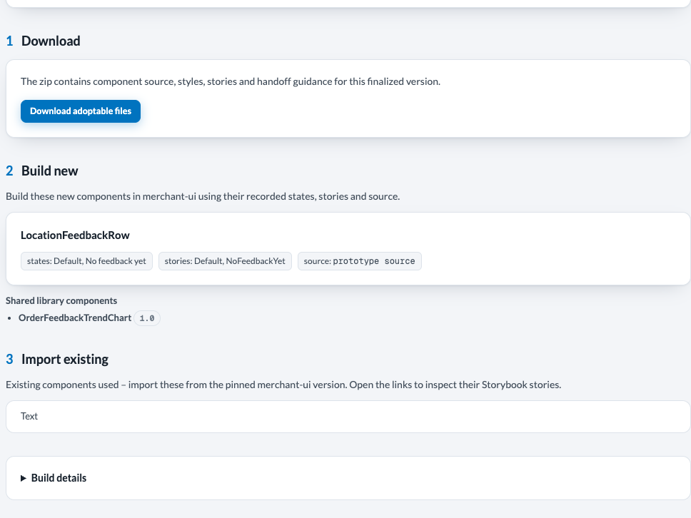
- Hand-off – a finalized React version’s Design assets, Overview, lists new components (states, stories, source) and the shared library components it uses. In the adoptable files, a change sits under clean-export/ at its merchant-ui path with a <Name>.base.diff; stale library components are quarantined (see adoptable files).
- Sync – a merchant-ui release reaches Sketch as a new design-system version, built from a merchant-ui checkout by Sketch’s own sync tool (tools/merchant-ui/). It includes a snapshot of its components’ source and props.
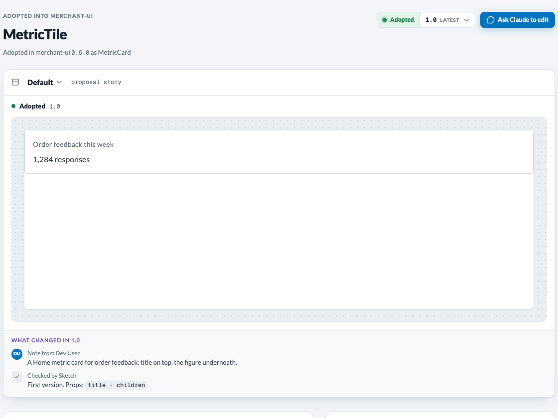
- Reconcile – once per new merchant-ui version, with no one acting, Sketch compares the library with that snapshot. A new component whose name shipped becomes Adopted. A change whose live component this release changed becomes Adopted when the props match exactly, and otherwise waits in the release review.
 ✥
 ✥
If engineering renamed a component on the way in, map it: sketch component map <Name> --to <Export> marks it adopted as the merchant-ui export.
The release review
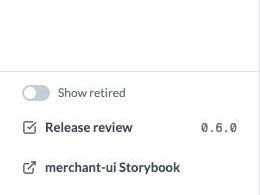
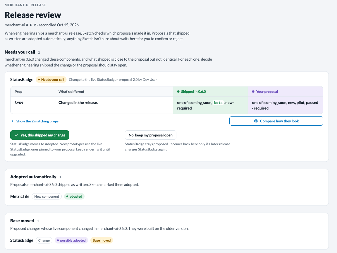
Release review, at the foot of the catalog’s side navigation, shows one merchant-ui release: what it adopted automatically, which proposed changes had their base moved, and what Needs your call – changes that shipped close to the proposal but not identical.
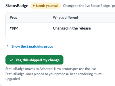
Each card names the proposal and its author, then a props table, what shipped against your proposal with the differences first. Compare how they look renders both. Then decide:
- Yes, this shipped my change – it moves to Adopted. New prototypes use the live component; ones that use your proposal keep rendering it until upgraded.
- No, keep my proposal open – it stays proposed, and comes back only if a later release changes that component again.
 ✥
 ✥
 ✥
Ask “What did merchant-ui <version> adopt from the component library?” and Claude reads the review and reports it. It confirms or rejects an adoption only with your go-ahead, the same ask-first rule as component warnings.
After adoption
An adopted component moves to Adopted in the catalog, and Claude is offered the live merchant-ui component instead of the proposal. Prototypes built on the proposal keep rendering it, and the viewer shows that it is now live.
On a variant’s latest version, Upgrade to live makes one new Iterate version that uses the live component; older versions show the notice only. Sketch refuses when the prototype edits the component itself rather than using it from the library, or when its merchant-ui version doesn’t include the live component yet (upgrade the design system first).
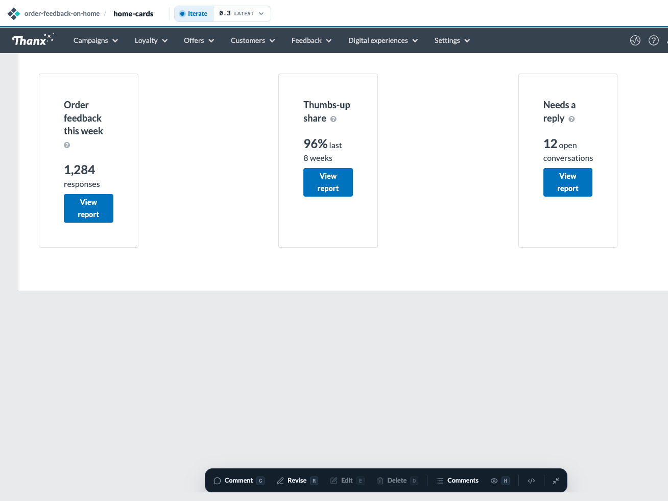
Switch this prototype to the live OrderStatusCard.
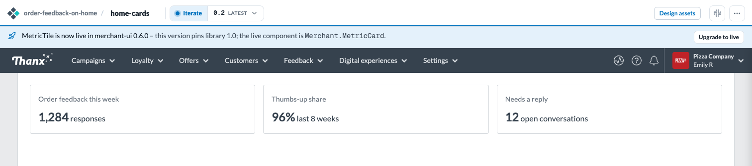 Now live – the notice names the live component and offers
Upgrade to live above the existing prototype.
 ✥
Tokens today
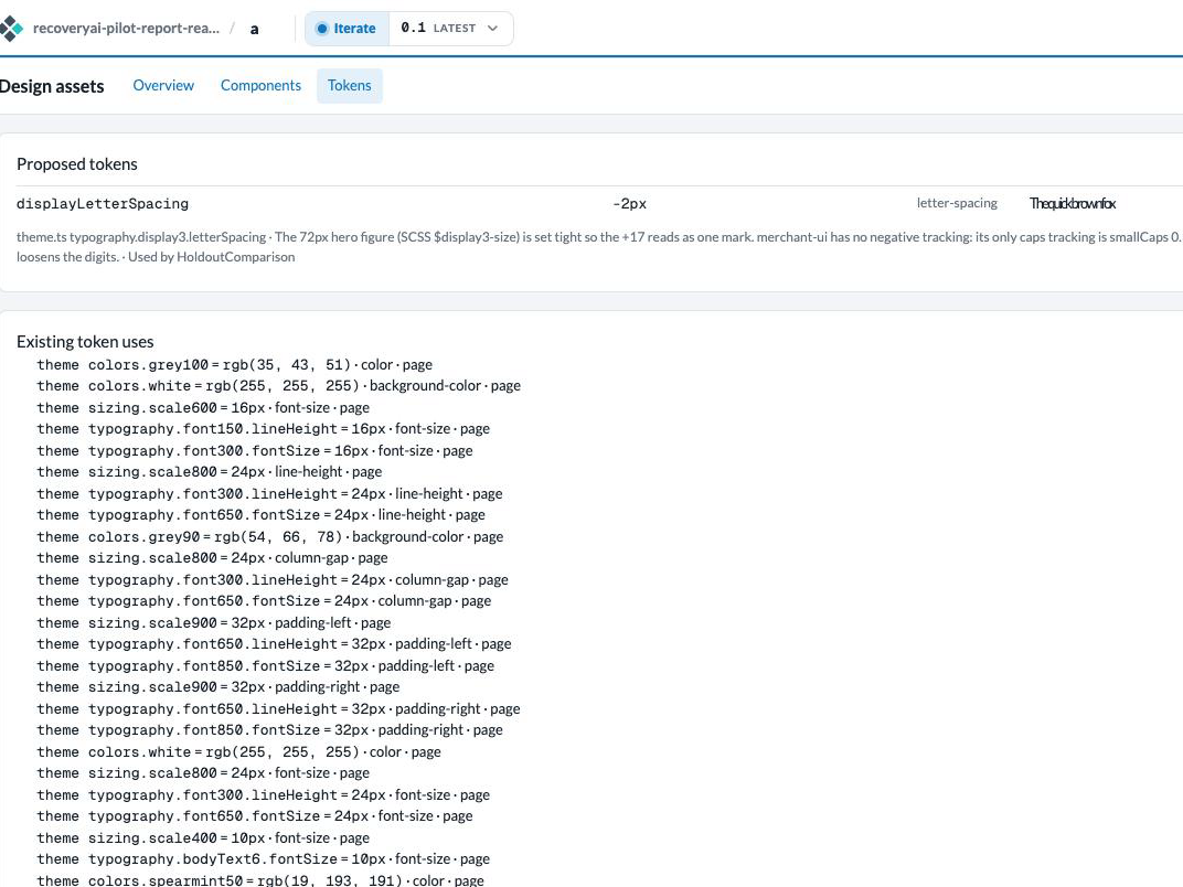
Claude uses an existing design token – a named color, spacing or type value – whenever one fits. When a value is genuinely missing, it declares a proposed token instead of a bare value, and records why in the sketch’s decisions.
- Upload judges each proposed token: a value close to an existing token is reported as that token.
- Design assets, Tokens, lists proposed tokens with samples, plus existing token uses, near matches and new values.
- Generate draft token addition produces a CSS file in the design system’s own format, for a person to review, on a published version. It is never merged automatically.
 ✥
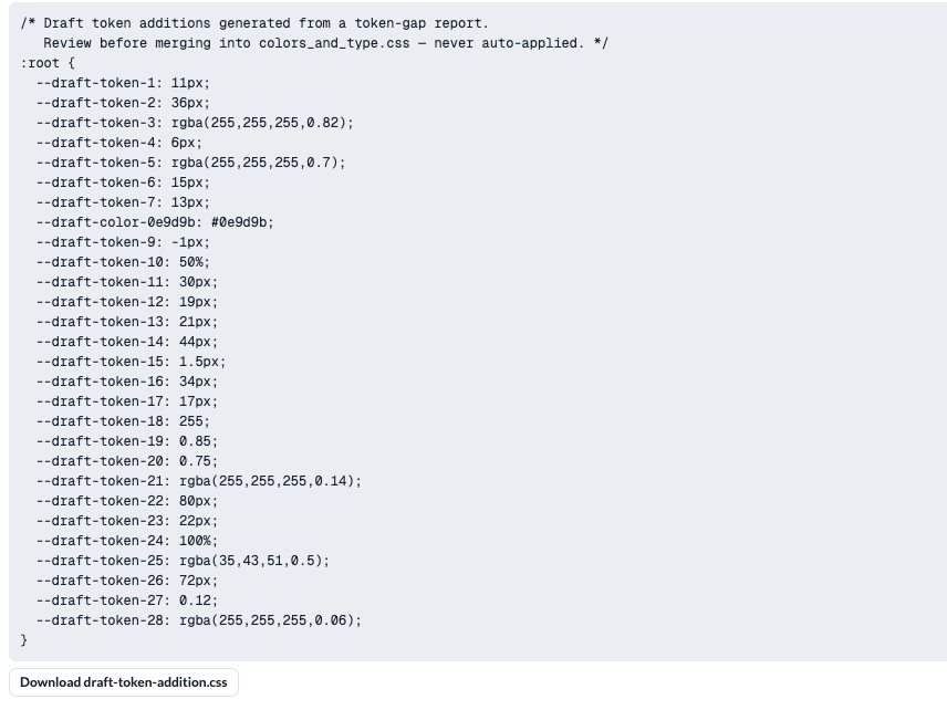 ✥
Proposed tokens have no queue, no release review and no adoption: nothing reviews or publishes one. A proposed token reaches a design system only when a person adds it there.